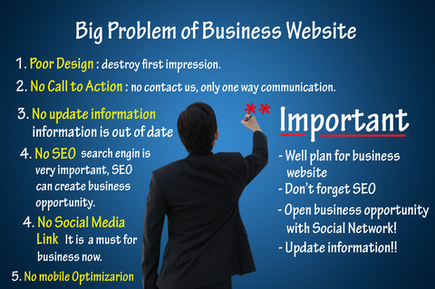
While it is possible when you first start out to use only sales pages, which are focused advertisements, to conduct your business, you want to eventually have a professional presence. Your website is your official ‘storefront’ or ‘head office’.

So even if the majority of your sales are done from the sales pages or other ‘online store’ sites that display your links, you should have a website that tells who you are and what you are about. This should also have your links. Ideally your website will include a blog right on it.
It’s a very smart move to use a free blog theme from WordPress to build your website. So what you have then is more or less a ‘monetized’ blog ; however the blog does not need to be the home page and you can have a nice advertisement or your own logo as the main focal point of your website. It’s also very easy to use WordPress widgets and pages to develop your site.
If you have ever sat even for 2 minutes looking at HTML code (the language used to build most websites) you would realize what a blessing it is that this is all done for you in WordPress (PHP). You would only need to know very basic HTML – just enough to copy and paste your links into your blog posts or pages.
Even at this it is menu-driven in WordPress, but you should know the parameters so you don’t mess up the block of code by placing something in the wrong area. It is very simple to learn just the elementary protocols just by looking at the code logically. It is all pretty much the same in this regard.
Since you now have a professional online presence with your website, you should consider some things. You want to make your website attractive, welcoming and easy to navigate for people. This would involve for one thing, choosing pleasant colors that are attention-getting without being garish or glaring.
Look at it yourself in different lights – how does it make you feel? Relaxed and ready to learn more about the products or business? Or does it make you nervous? If you have too many things flashing and blinking and popping up, the person may leave because it is too tedious to read anything.
Another issue is making good use of menus – It is a good idea to have a horizontal navigation bar that lists your pages, as well as a vertical listing on the sidebar such as would be done with text widgets. Make it easy for people to find what they need so they don’t give up and go away.
There are many other fine points you will wish to consider such as a call to action and making your ‘about us’ and ‘contact me’ pages friendly yet professional. Remember you mostly ‘don’t get a second chance to make a first impression’ so put your best foot forward!